Title Design Websites
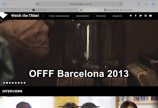
I am researching this title design website for insight on the variety of title designs. Looking through the website, I was able to see the how different all the designs were. From the title design of “13” to “A Fistful of Dollars”, it is evident that there is no limit when it comes to the creativity of these designs. The color palettes, lighting and levels of sophistication truly are demonstrated through the designs seen on the website. The title design for “30 Days of Night” involves a neutral and darker color palette, with dark and gloomy lighting. The lighting is representative of the darkness of the movie obviously, whereas the title design for “Along Came A Spider” seems to also be along the same lines except it has more of a darker tone, with the computer screen. These examples of title design show that the designs can vary from anything you could possibly imagine. It also shows that there are no bounds when it comes to the process and how you can tie the design right into your film. I have also learned how some designers and animators have come up with these designs, especially when tying the design ideas into the title design. For example, in “Along Came A Spider,” the “A” in every sequence was brought down by a spider web, thus tying into the title of the film.


Comments
Post a Comment