Title Design
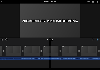
The title of the film will most likely be “Why Do You Ask?”
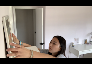
The titles will be in a bold, white font and in all caps. Because the title sequence will be at the end of the opening sequence, I wanted to leave viewers on a higher, uplifted note. This is based on the last scene, where the main character finally realizes she needs to get help. I decided a lighter gray and white font would be best. Alongside this, the font will appear to be “typed” onto the screen, and will stay on the screen for two to three seconds.


Comments
Post a Comment